Produlect Branding
Visual identity for an independent global product management company with a pioneering mindset and a progressive work culture. Team of project managers, scrum masters that collaborate with several agencies and software studios around the globe. They are expending theirs wings and formalising their bond by creating a company. Bringing clients together and support each other closely.
The Challenge: Create bold and easy to maintain identity
To create visual guide for an independent global product management company
with a pioneering mindset and a progressive work culture. Create a set of rules and templates easy to scale and use not only for designers.
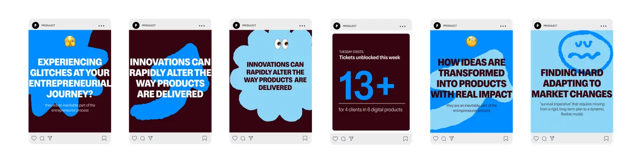
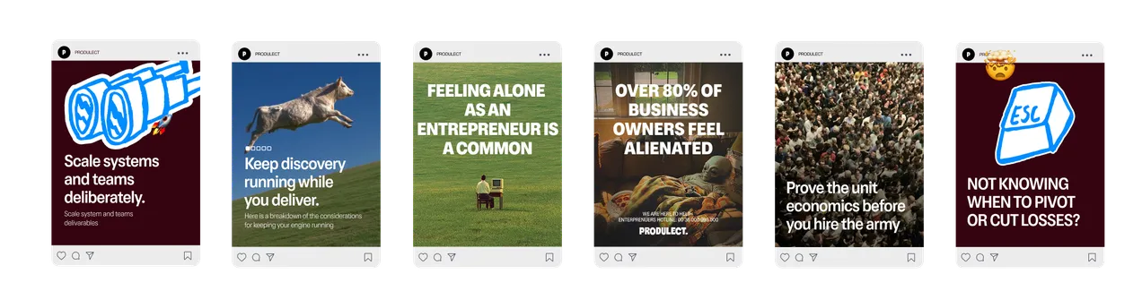
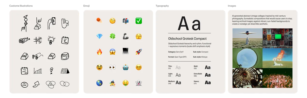
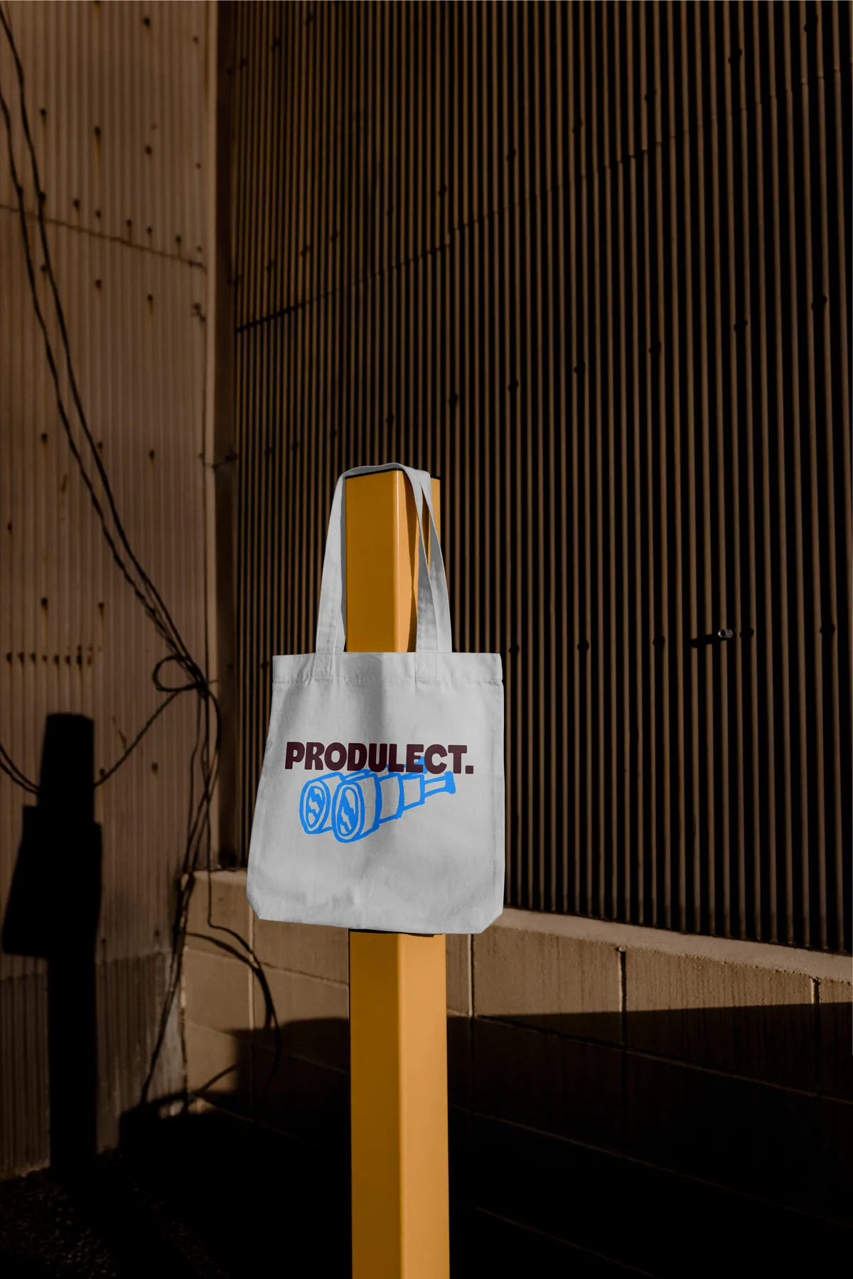
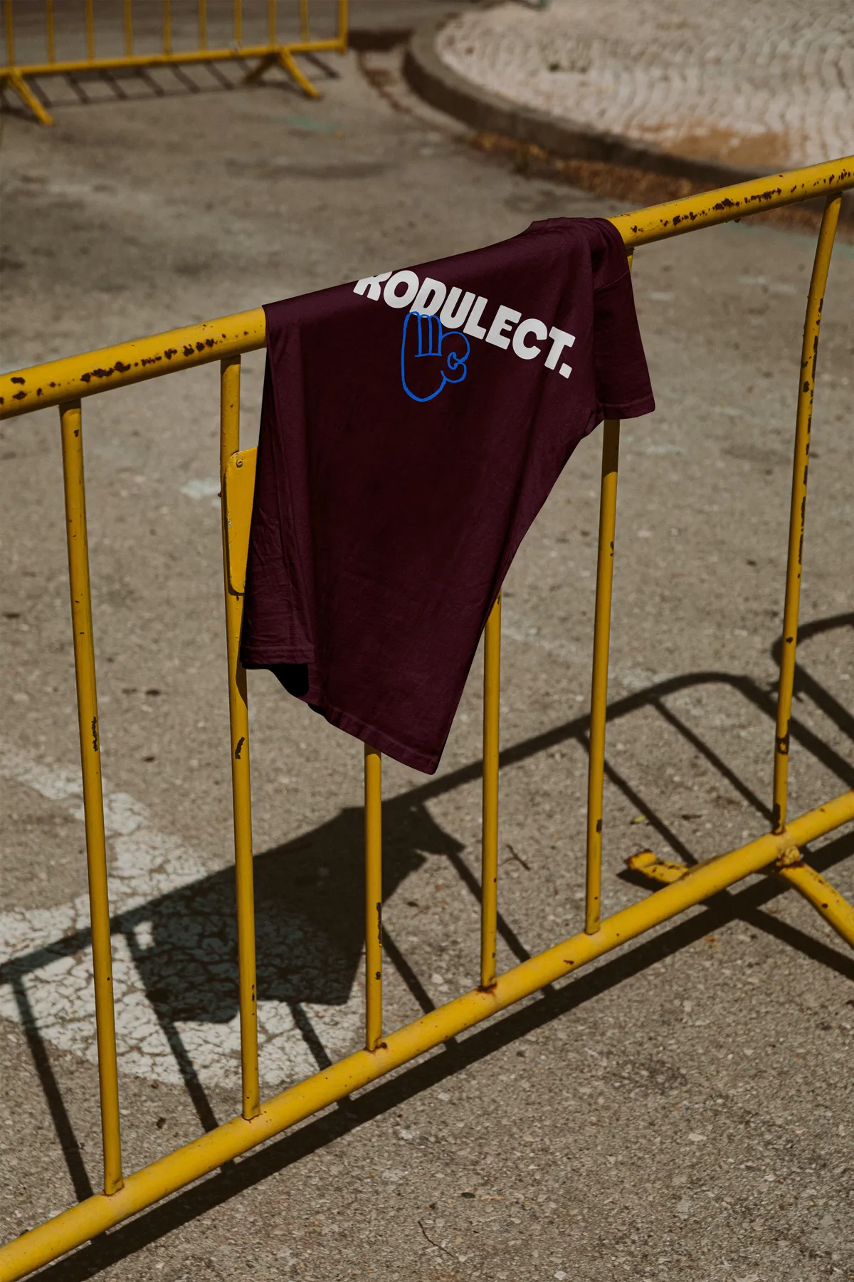
Whiles briefing it was transparent that they want to stand out from the sea of competition. I conducted a research based on the list of competitors that Produlect provided. After discussions and creation of a mood board we decided on a bold colour pallet that will make them stand out. I explored the path of custom illustrations that will bring a bit of human touch to a branding. I created a set of illustrations that are hand painted and afterwords digitalised.
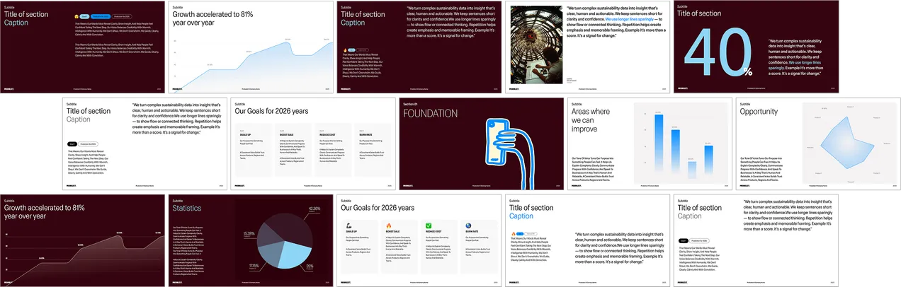
Scalable layer system:
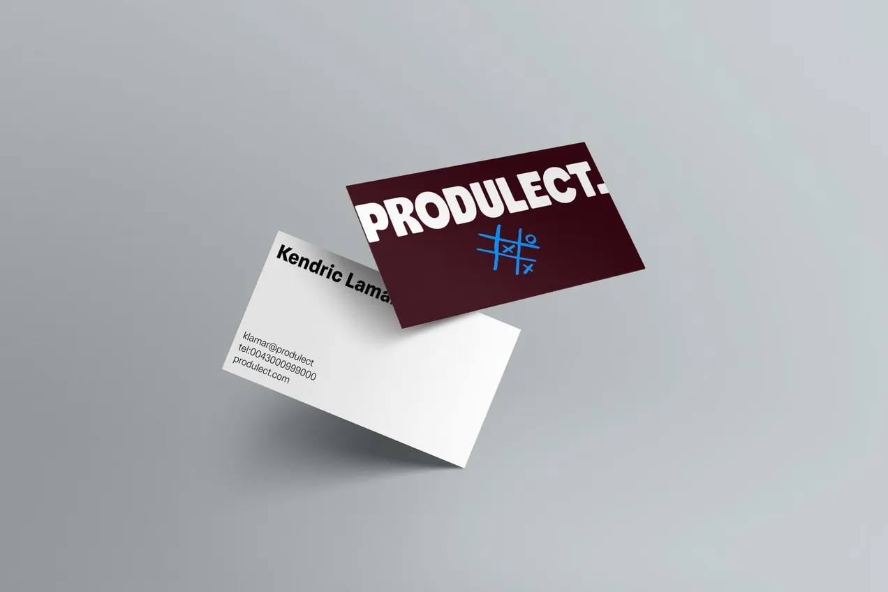
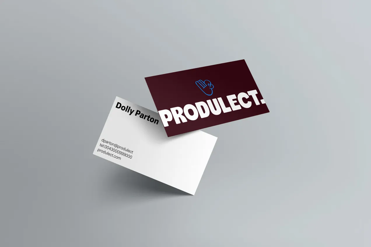
The system is built upon a modular architecture of interchangeable layers that can be seamlessly integrated or utilised independently. Depending on the medium and intended tone, creators can leverage three distinct components: a proprietary library of custom illustrations, an expansive emoji set designed to complement or function as iconography, and a foundation of modern typography paired with surrealistic, AI-generated imagery to establish a unique brand identity.
I decided to use modern font with a nod to classics sans serifs. When we looked at the competitors most of them communicating with modern sans serfi fonts and we decided that this could be another opportunity to stand out from the crowd. This font paired with fun images, emojis and illustrations will give us the right balance to reach different audiences. As produlect is working with corporate clients and startups, they needed that variety to present them selfs on few different levels of seriousness.
This framework prioritises adaptability, offering a broad spectrum of visual density. Depending on the medium, the system can transition from complex, layered digital environments to a clean, understated aesthetic for print, ensuring the brand remains effective regardless of the format.