Maturity Matrix Tool
The Challenge was to design a tool which helps evaluate Maturity Level of a client. EcoVadis was seeking for a solution that would bring the current process to another level. Up to that moment CSMs were using heavy excel sheets with list of questions. Whole process was uncomfortable and time consuming. After first meeting with stakeholders I realised that I needed to find out how CSMs across company use this tool and what role it plays in their relationships with clients. After a few interviews I realised that current excel sheets are used differently by different people and that there is a lot of issues that needs addressing: not only related to a tool itself, but also language and structure, reporting and last but not least recommendations.
Opportunities and Challenges
Opportunities
• Current Excel Sheet isn’t a user friendly tool, it causes a lot of stress for CSMs at the meetings. Improving this experience will make EcoVadis look more professional and will reduce stress for CSM team.
• A user friendly tool will speed up the process and will save a lot of time for clients and CSM team.
• Visualising data of results and automatisations of recommendations will help clients understand better where they are and how to improve faster.
Challenges
- Finding a good way to present this amount of content in digestible way might prove difficult.
- Currently recommendation are put manually, we need to find a way to make it more structured.
Competitive Analysis
A lot of companies offer consultancy in sustainability area but most of materials are hidden and accessible only after purchasing the services. Based on accessible materials I attempted creation of competitive profiles (in terms of marketing strategy, content) with SWOT analysis that helped to assess current offers in this area
Generally
Current process needs improving. Excel sheet is massive and super difficult to use specially with a client on a call. CSM’s need to navigate through a table, whiles scrolling and adding comments, which causes a lot of stress.
Interviews
With insights from online meetings with stakeholders, a research and brief I conducted interviews with Customer Success Managers. We couldn’t interview clients due to time restrictions.
Main Questions:
• How we can improve current process?
• What is the most difficult part of the process?
• How do you prepare for interview like this?
• How do clients react to the current process?
• How do you find your recommendations?
Based on the responses received, I formulated questions for an online survey that was answered by 22 CSM’s around the globe that works with clients in different maturity levels. Of course the survey is not representative, especially that there are differences between EV employees and clients agendas but it gave us a lot of data and insights already. Specially a lot of information based on which we can create a logic and structure of our Recommendation Library which proved to be a big pain point for CSM Team.
Findings from interviews and surveys
INTERVIEW INSIGHT #1
CSMs are nervous before the meeting. They are aware that excel sheet isn’t the most sophisticated tool in this case. It is also uncomfortable, as all cells look the same – it is hard to see where they are when they scroll back and forth. They all fear of looking very unprofessional on a long workshop with a client using excel.
INTERVIEW INSIGHT #2
So far recommendations are put together manually, they have a deck with a list of links, videos and publications but it is not structured. It takes a lot of time to match specific client with their needs from the industry or region.
INTERVIEW INSIGHT#3
Clients are anxious at the beginning, especially the ones that are not very mature. They get stressed and before the meeting, they ask for a read through so that they can prepare and ask questions in their company. Sometimes language is too difficult for them.


Building empathy
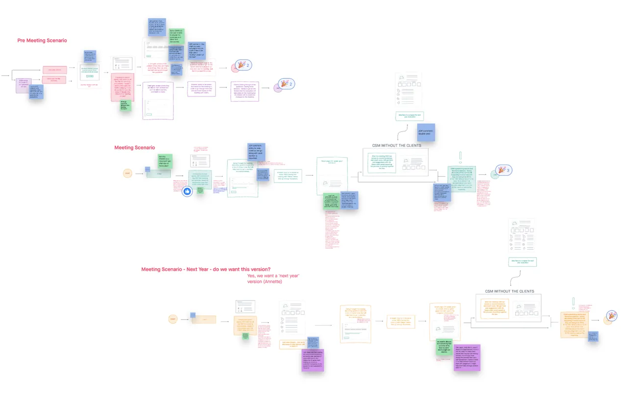
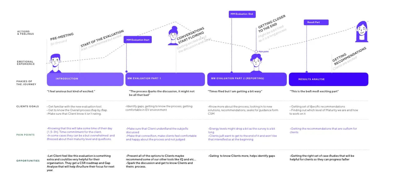
Using the quantitative and qualitative data from interviews and survey results, I defined the three target group profiles: Alex, Tina and Matt to better empathise with my main user groups and prioritise goals according to their needs.

After gaining insight in to Customer Journey I was able to identify pain points and challenges.
• Uncomfortable tool, hard to identify where we are at the journey.
• CSMs have to take notes at the meeting with clients and they need a space for it so a client can see it – now they scroll through a massive excel sheet.
• As all cells look the same it is hard to see where they are when the scroll back and forth
• No unified library for recommendations
•“Sometimes when we have grouped answers: Reactive, Responsive, Proactive, Leading – Clients try to fit to higher category.”
• Issue with just not being very professional at a long workshop with a client and working on excel

After conducting series of interviews and gathering all information from surveys I was able to identify further profiles and on this basis CSM team could set rules for the recommendation bank with EcoVadis Case Studies, Testimonials and White Papers for clients in similar Levels, Industries and Area.
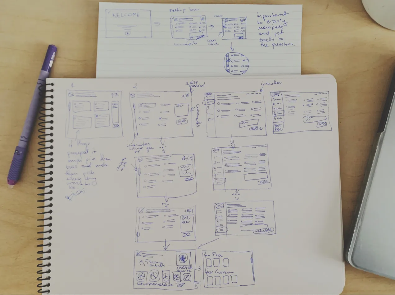
Building low-fidelity wireframes.
With low-fidelity paper prototypes, the planned syllabus and the general structure of the application could easily be tested in usability tests. Without much effort, adjustments could be made before going into the much more costly digital implementation.
Clickable prototypes
After some paper prototyping adjustments, wireframes, mid- and high-fidelity prototypes were created, which I supplemented with click-ability using InVision. User tests revealed small vulnerabilities in the structure of the user interface, like:
• Way to easily identify questions that were left to answer for later.
• InfoBox Display before submitting the form with information which questions needs extra attention before finalising the process.
• Extra screen before reviling Recommendations and score.
Visual Design
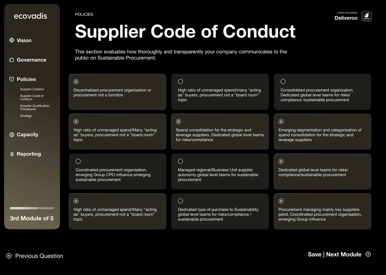
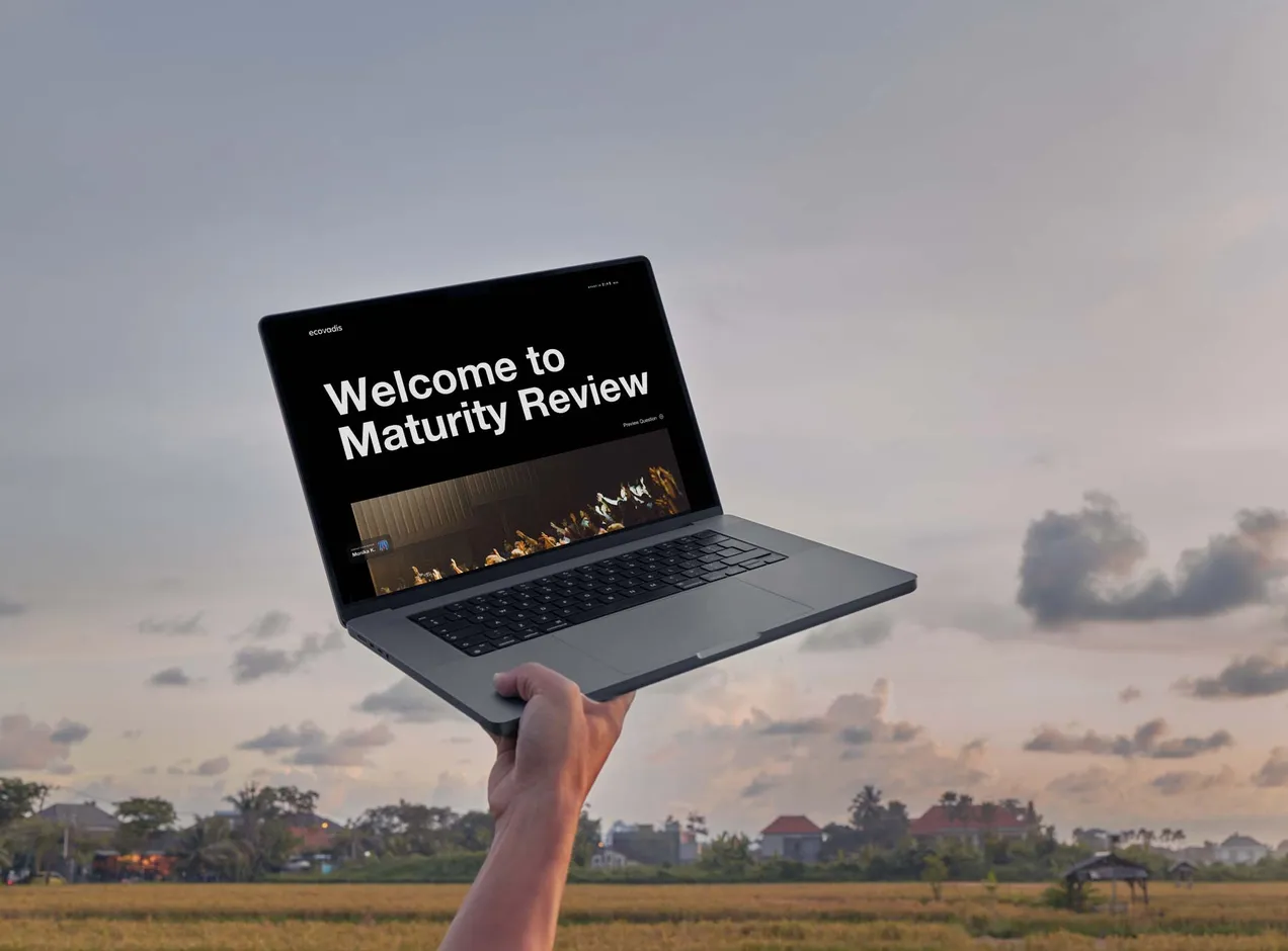
The visual design was developed by iterating from EcoVadis Brand-book to a dark mode for EcoVadis Brand.
As the project was created for long sessions with clients looking at the screen and going through the tool, question by question, I decided to use a dark mode that would reduce the eye strain and would add this extra cosy mode and high-end effect that CSMs were after.
User Experience
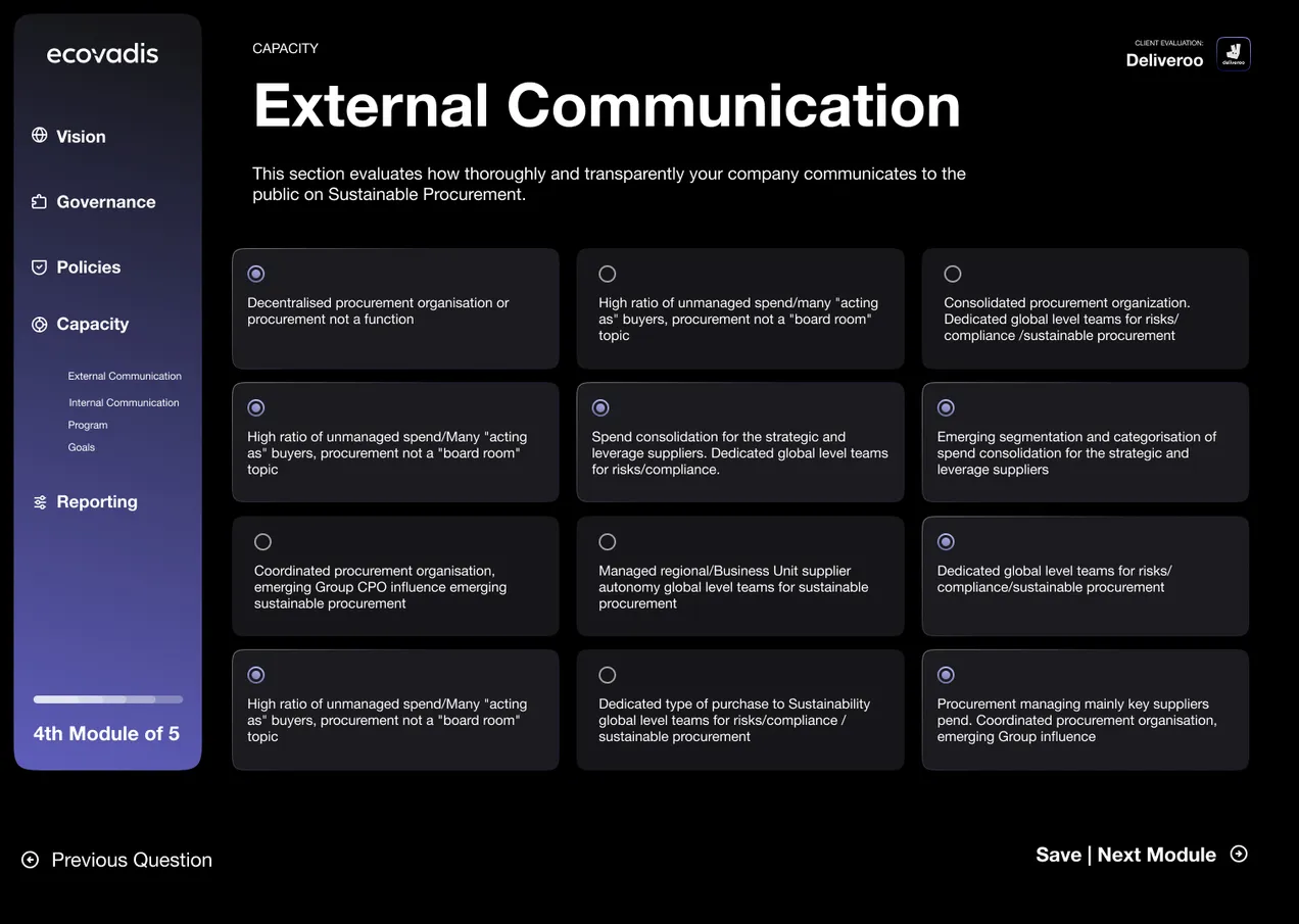
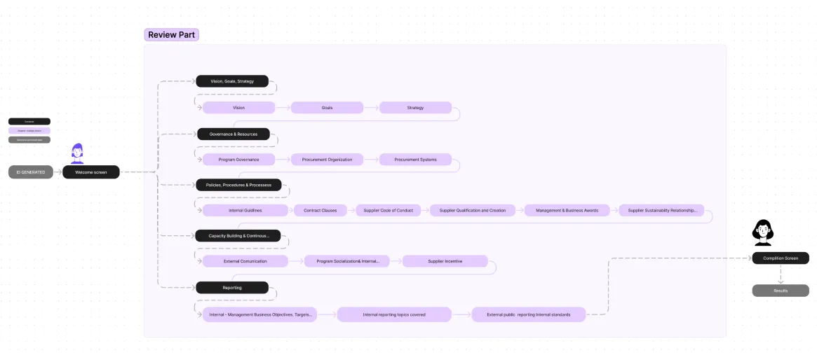
• To help users identify where they are and how much of the journey they got left, we split our questionnaire in to 5 categories. So it is easier to digest and track. It is also easier to split the process in two meetings. In case when client do not have enough time to spend on one meeting.
• Note area is placed on the top of each tail, so after the meeting CSM and client knows exactly which comment are referring to which answer.
• In order to provide more information how many question are left I added a progress bars in bottom left corner with marked answered questions and faded line for those to come.
• I decided to remove level of maturity and mix answers on all questions, so they are not grouped and users can’t identify which answers will give them better score.
• After hi-fidelity mockup I also added a set of notifications, for questions that waits for respons that were missed or left for latter.
• Based on Personas, Industry, Region and level of maturity CSM Team managed to add tags to recommendations.
Interface Design
• Dark mode was chosen for this specific tool as we were looking for more cosy but luxury experience. Also to avoid eye strain as clients will look at the screen for duration of the session which might take up to 2h.
• All 5 categories have they own assign colour so it is easy to recognise when another section is reached. Colours were created from original brand colours but adjusted to dark mode. Turquoise colour was replaced by purple as it is now reserved for ev platform use only.
• Txt colours on buttons and in the tool were tested with a11y plugins, so to be more accessible some colour buttons have white txt and others dark grey.
• Icon set for this specific tool was designed with respect of brand guidelines. Consistent line thickness and grid stands the test of time and works well with presented layout. All icons have the same colour as sections assigned to them, so when presented out of section context (like on recommendation page) not only a shape but colours gives a hint of connection.
• Side Panel serves as a navigation. All five sections are listed with icons. I decided to make titles visible at all time to be more user friendly. When users are in the specific section the tile is showcased in full saturation and list of specific topics rolls out.
• To showcase the progress inside of the section I added a small indicator on the edge of the menu. Coloured line stretches alongside with the progress of listed topics in the sections.
•Non active sections of the tool are greyed out, only icons are left with colour after completion.
•At the bottom of the side panel i decided to add indicators how many sections/ questions are left for this specific session and full assessment.
Conclusion
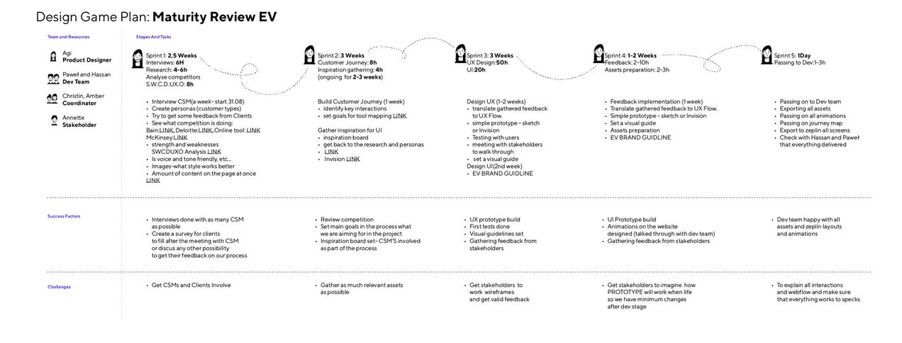
• Writing down the Game Plan was super helpful – Big challenges require small steps, especially when designing an application in a team of many stakeholders and one designer ;).
• Accordingly developed plan gives more insights and a realistic time frame that steered me toward the intended direction. Structure and timeline give a subtle nudge and needed motivation to fulfill tasks in the right order without skipping any valuable steps. But also gives a realistic timeline for a whole team to be aware of.
• Be open to research and let ideas go – I thought too digitally and approached the product with ideas about some aspects, thus research and interviews corrected my presumptions and steered me to a completely new take.
• More substantive visual design – As EcoVadis never used dark mode and this project started a conversation about the need (start of the pandemic and more people suffering from eye strain) Currently we are redesigning the whole color pallet to reach WCAG 2.1 and we considering using dark mode more frequently.
